"A Failed" Launcher Redesign
PROJECT NAME
Launcher Redesign Concept for EMUI
RESPONSIBILITIES
UX, UI, Motion, Prototyping (Live Link), User research, Presentation
DESCRIPTION
With the (original) plan to enter into the US market, we were tasked to examine and rethink how will a western-facing EMUI launcher differ. Given the constraints and progression of Android P, how can EMUI stand to differentiate and improve in the North America region? The goal of the project was to propose a set of design principle and to showcase the principle live in a prototype demo.
DESIGN PRINCIPLES
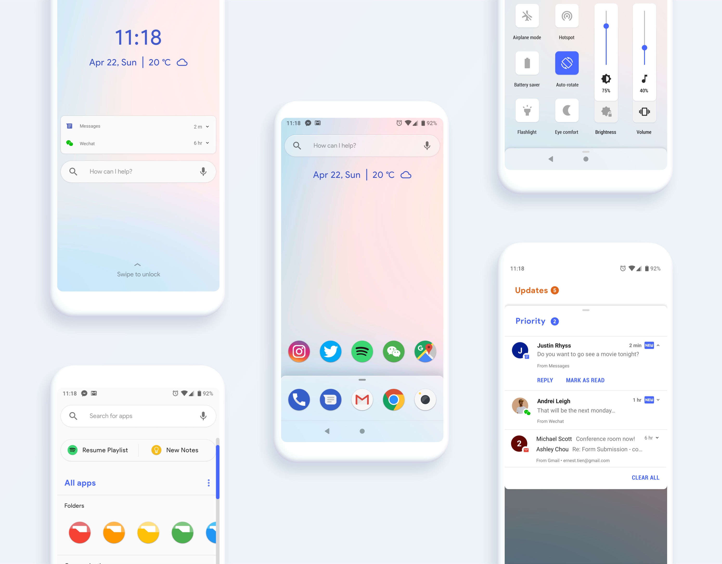
Raise awareness to unintended habituation and supply features that promote digital well-being. Reduce triggering reactions and allow the users to stay present at the moment
Abiding by standard Android conventions allows EMUI to be optimal in update speed and compatibility. Consistent interactions helps a user to be proficient in the platform they are familiar with.
Being extra cognizant about removing or using constraints and friction. Designers have the responsibility to guide the users in the optimal experience and not rely on the user to guide themselves.
UNDERSTANDING FRICTION INDEX
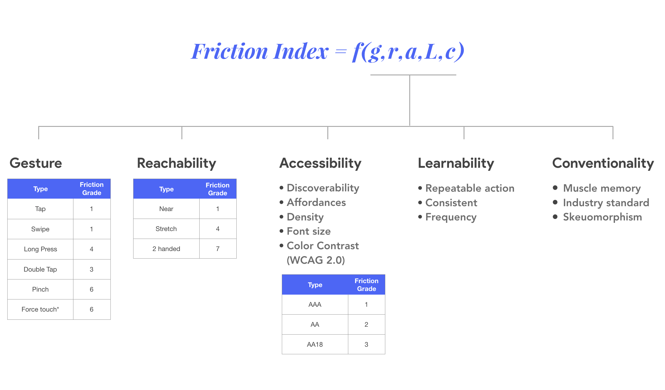
We created a way to measure "how difficult is it to complete an intent" called the friction index. This friction index help designers be more conscientious about how each design choice will impact the way we guide users towards certain behaviors.
EXAMINING THE LAUNCHER WITH FRICTION INDEX
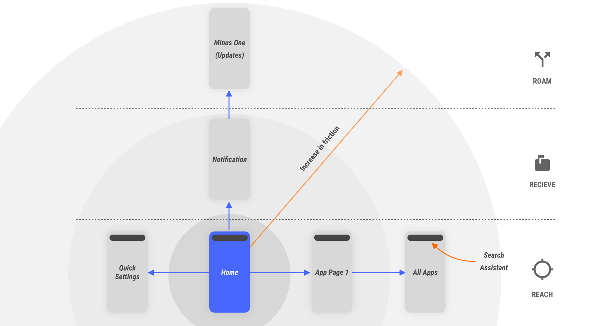
To examine how current launcher design causes unintended habituation and triggering, we broke down the intention types of when a user approaches their mobile device into three categories. Namely:
- Reach: User knows what they want and where to go
- Receive: Users want to get something done but need guidance
- Roam: Users doesn’t have a particular agenda and wants to free roam
We defined "triggering" as when a user unintentionally drifts from one intention to another. Examining the current Android launcher with friction index against each these intention types allows us to quickly realized where we can reduce unnecessary triggering. We then made a hypothesis that if we are able to design a launcher that friction grades intents from "reach" being the lower in friction and "roam" being higher in friction, we can reduce unintended triggering.
Friction index analysis allows us to ask the question:
"Are users unintentionally triggered by a notification when they want to lower the screen brightness?"
"Can we better capture reaching intentions before showing users with notifications on the lock screen?"
SCREEN-BY-SCREEN COMMENTRY
↑
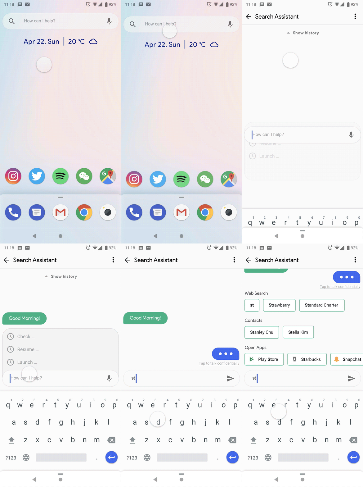
Search Assistant: Combining the best of search and the best of assistant. The auto-complete from search and the suggestions from assistance.
↑
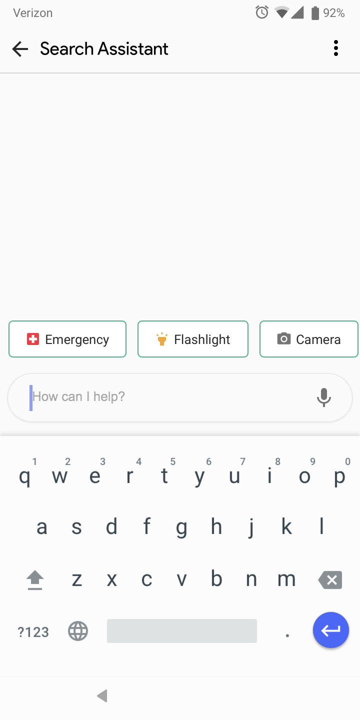
Search Assistant (Locked): Assistant suggestion is contextual. If search assistant is accessed from the lock screen, the suggestions are contextual
↑
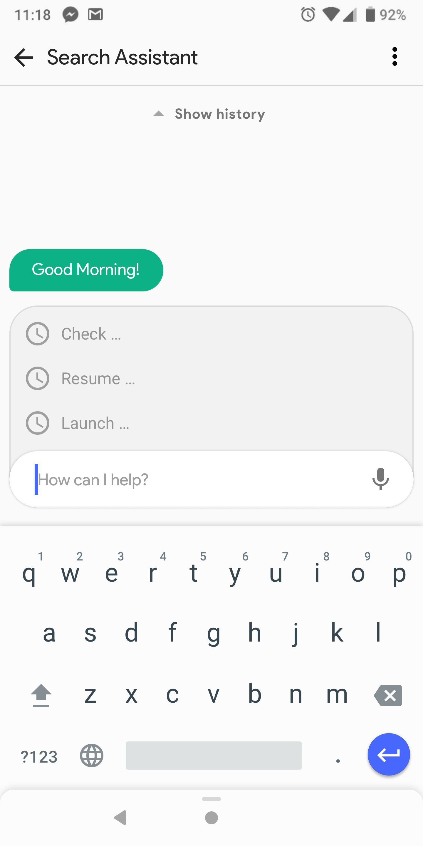
Search Assistant (Unlcoked): When the user does not have any immediate needs, the assistant can reach out to suggests help.

↑
Search Assistant (Unlcoked): If the users have something in mind to seach for. The assistant adapts its UI to the user's intent.
↑
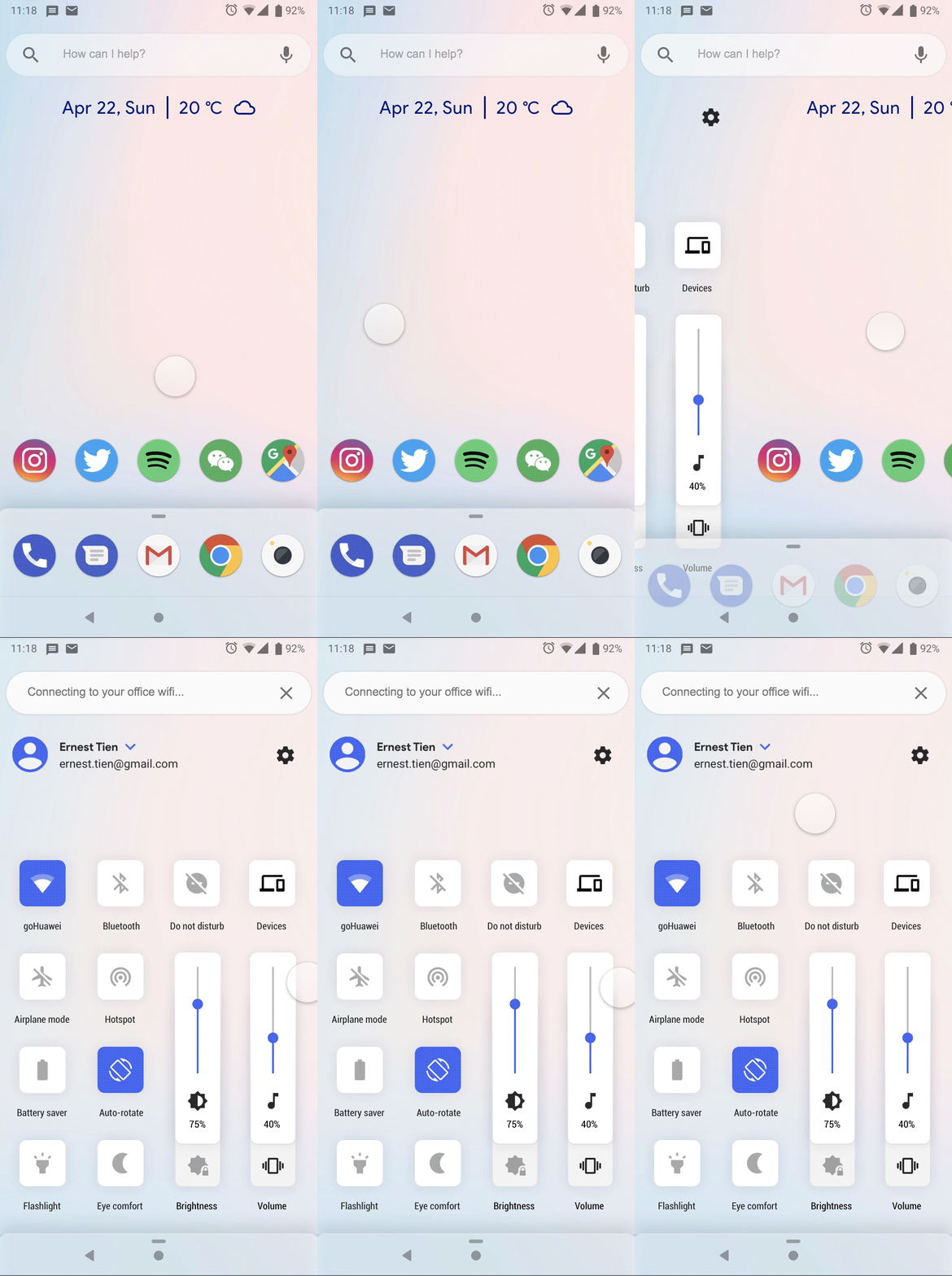
Quick Settings: Placed to the left of the home screen allows user to reach commonly used settings without seeing notifications.
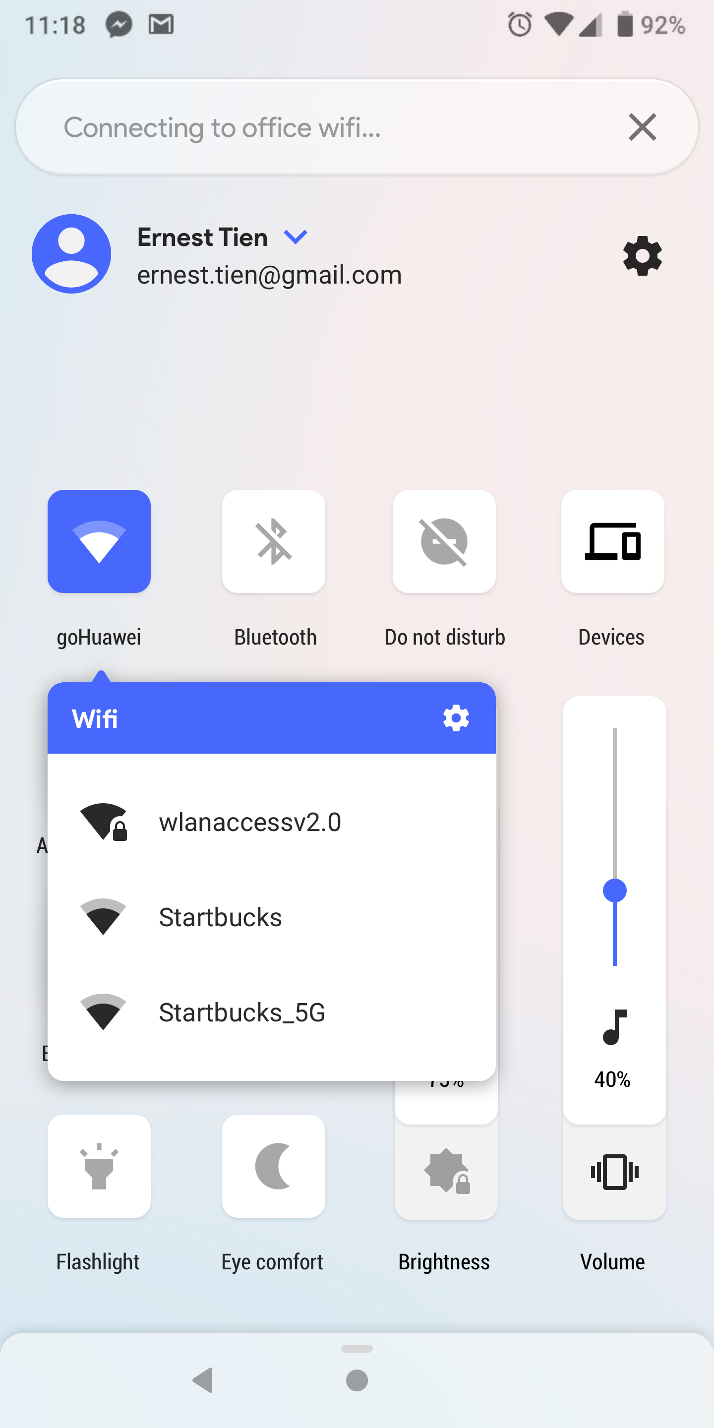
↑
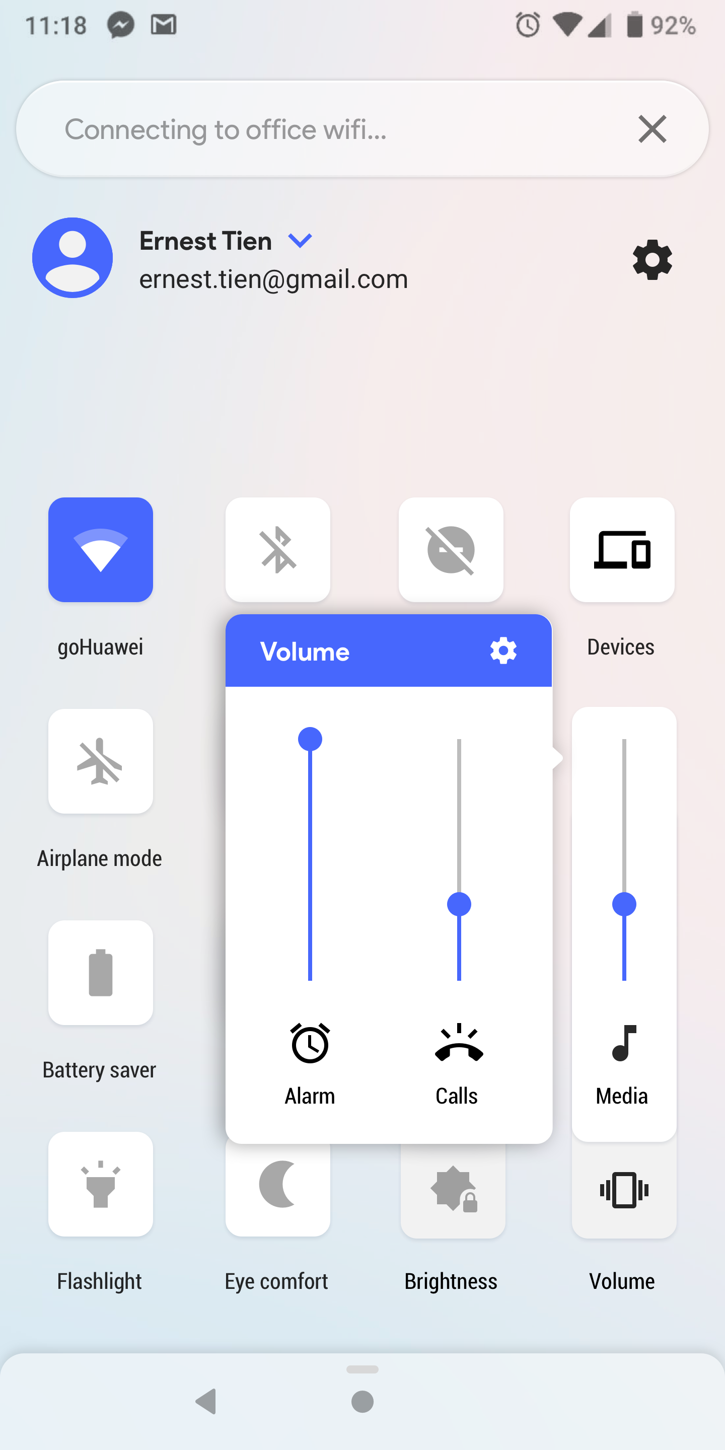
Quick Settings: Consistent interaction with app grid notification dot. Press and hold to access more settings.
↑
Quick Settings: Vertical slider used so that it does not conflict with horizontal swips to exit
↑
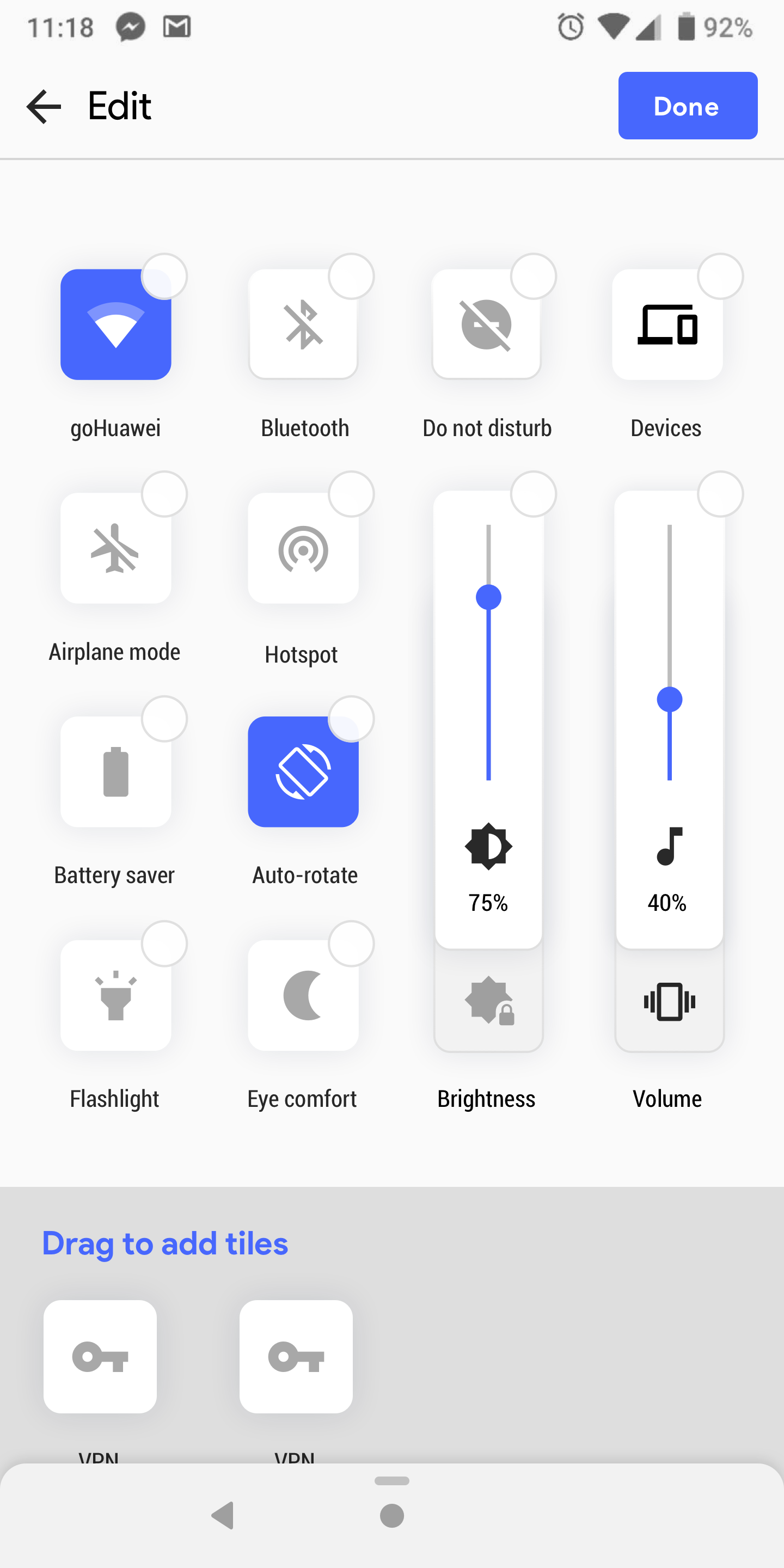
Quick Settings: By pinching or long pressing on the background sends quick settings into edit mode. This is consistent interaction with the app grid expereince.
↑
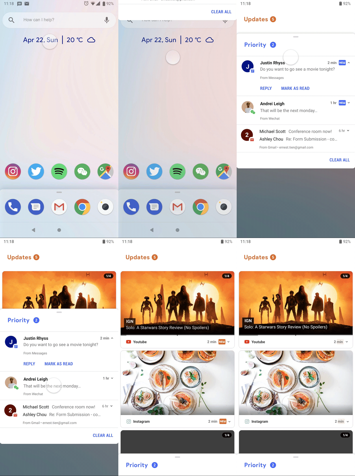
New Notification: Notications from the same source are also grouped under a timed carousel to discourage apps from notification bombardment.
↑
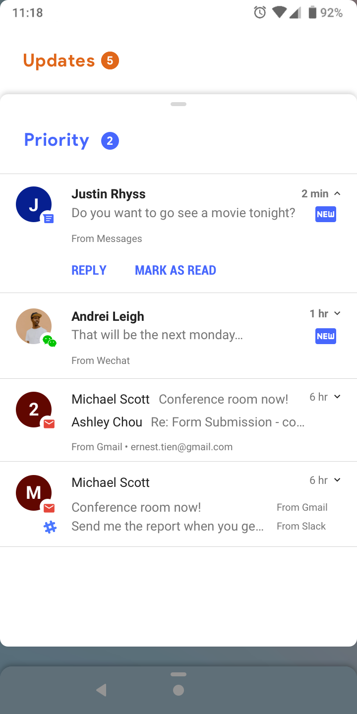
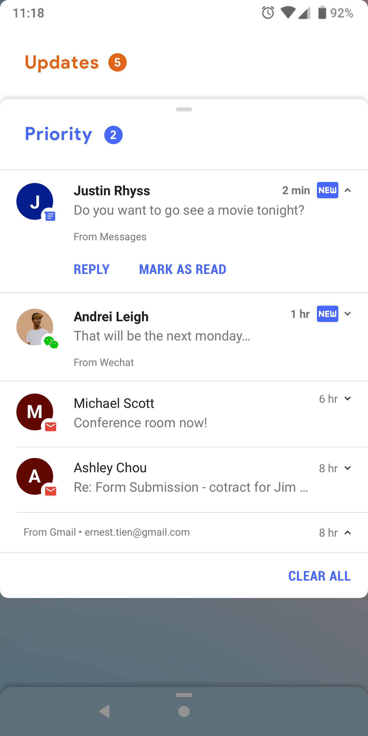
Notification: Categorized between priority and updates. Priority notifications are redesigned to put the contact first and foremost.
↑
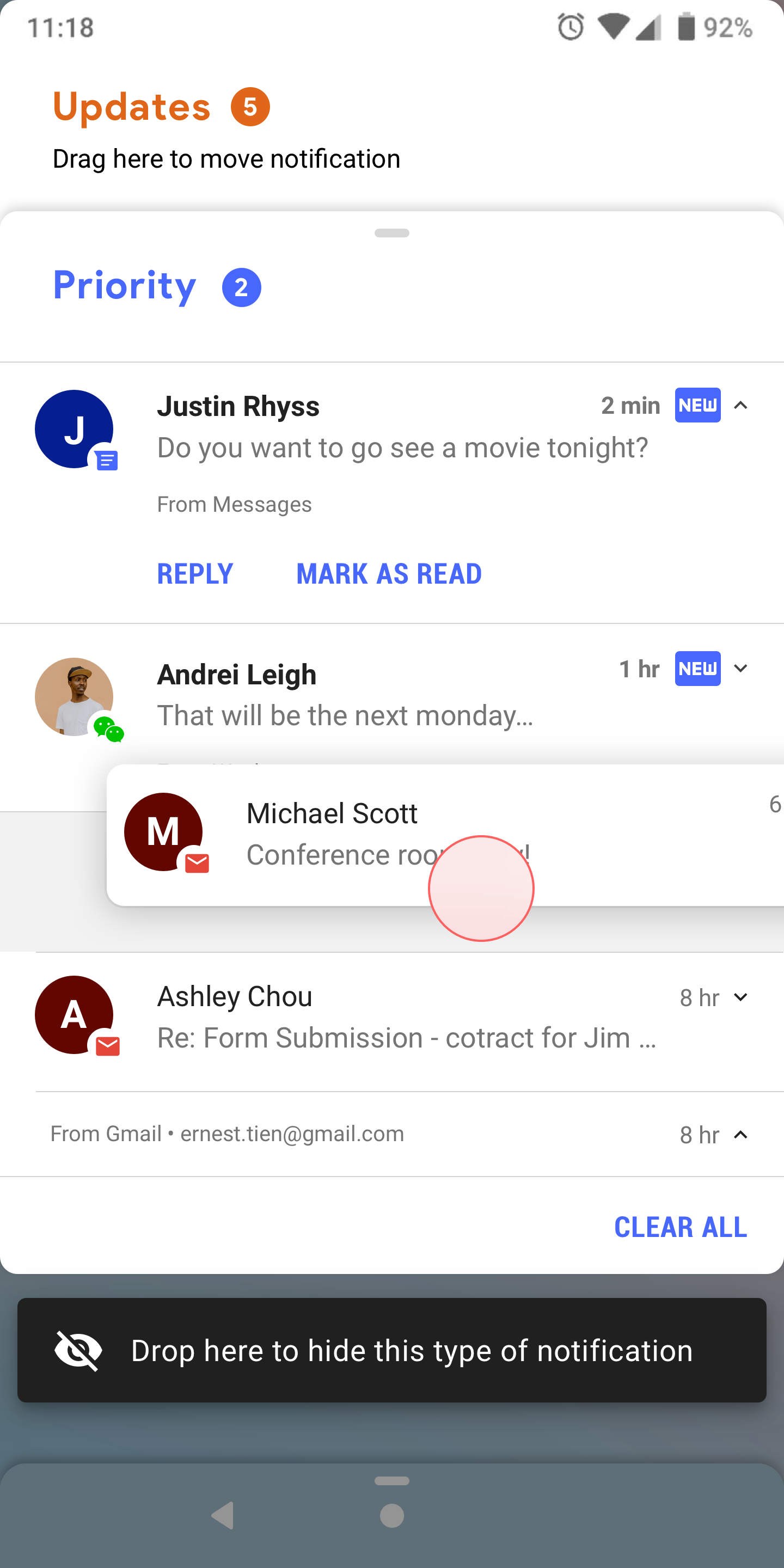
Training Notification: Users can pick up notifications to move and train the system to more accurately categorize notification behaviors.
↑
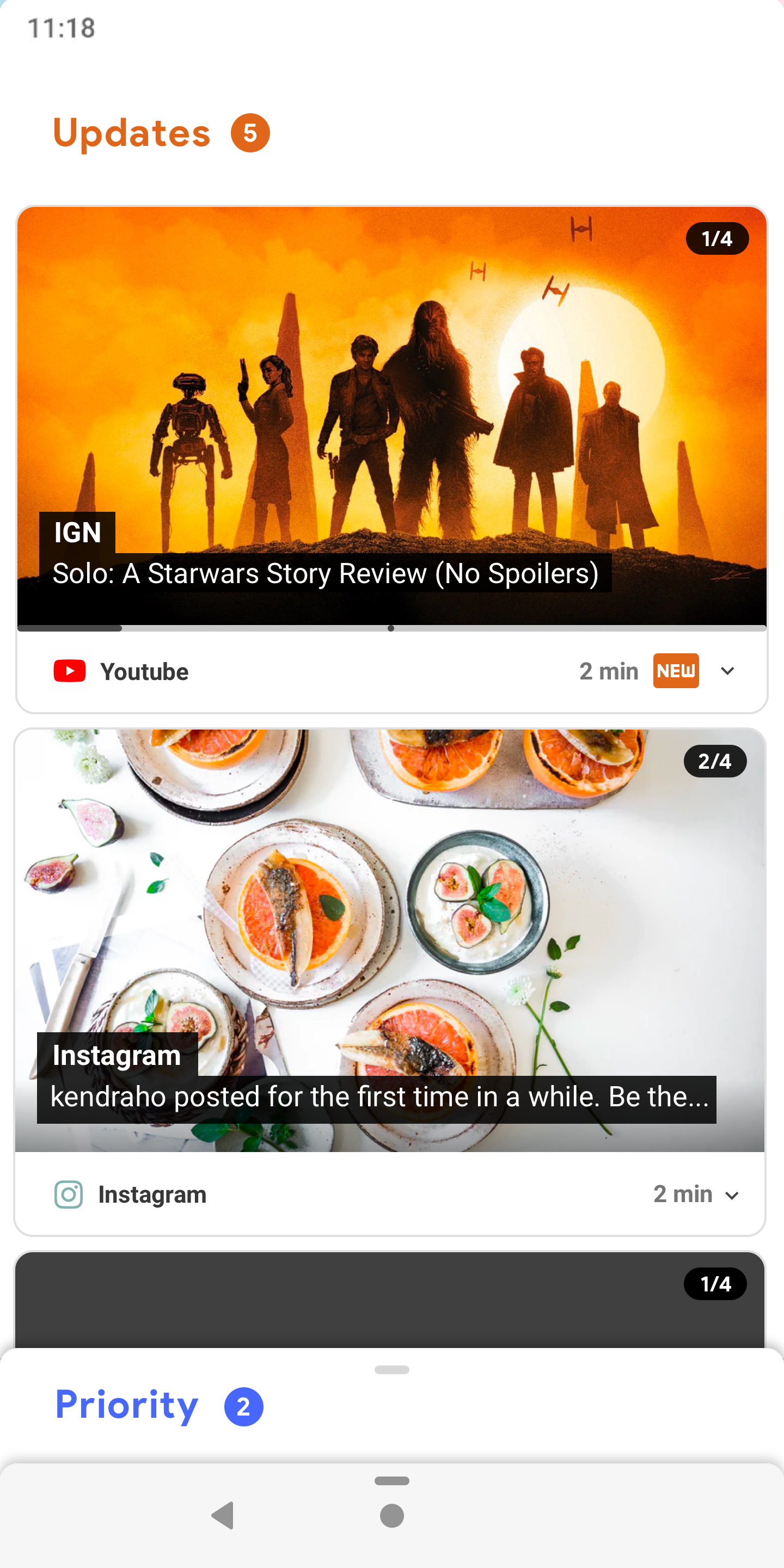
Update Notification: Updates are system generated notifications. Designed to have a focus on rich media content.
DESIGN ITERATIONS
↑
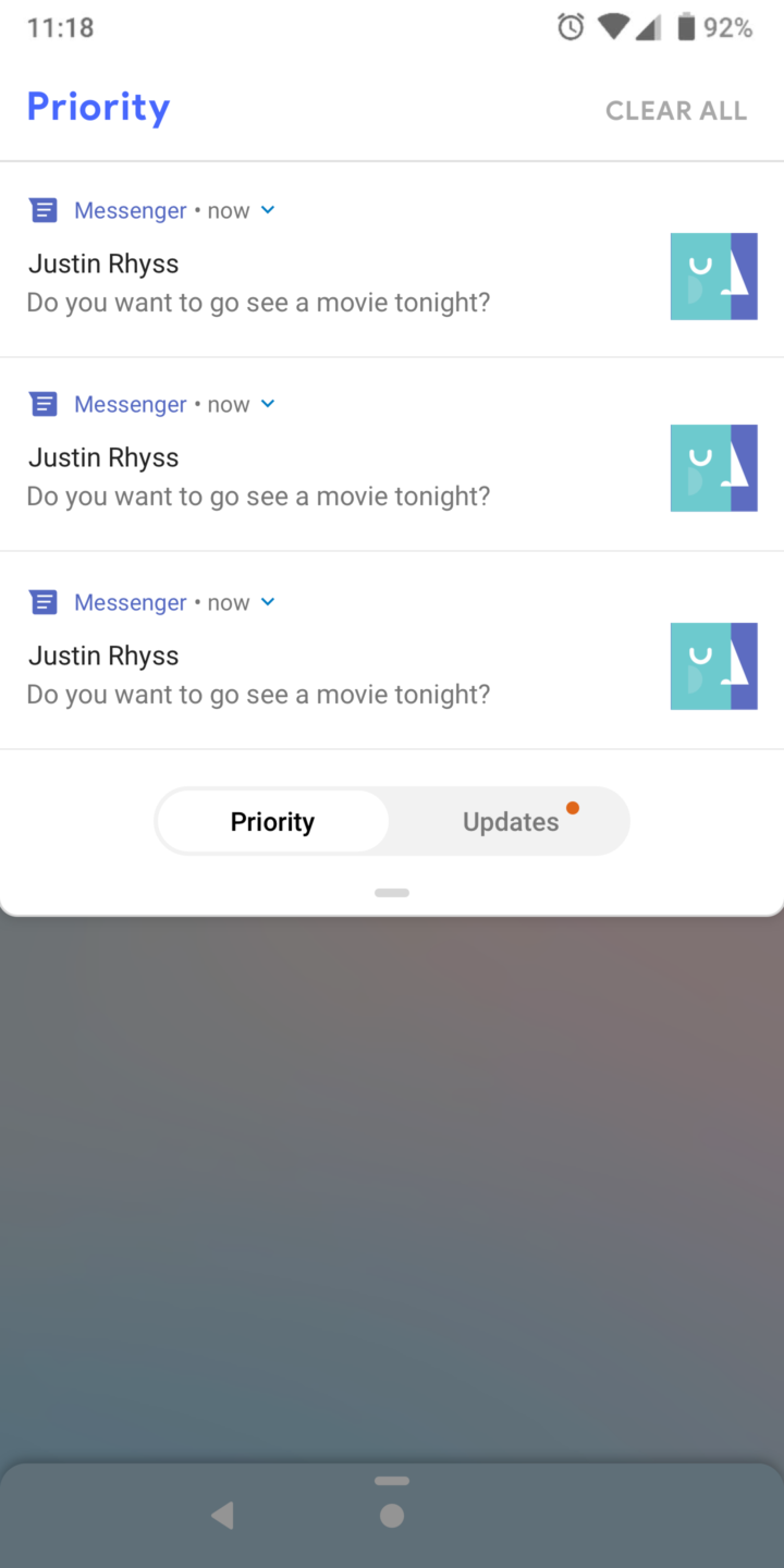
Bottom Tab Idea: Notifications are seperated into two left-right panels. The issue is conflict in gesture between dismissing notifications and switching panels.
↑
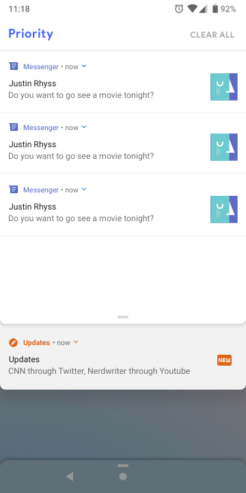
Layering Card Idea: This particular design had a gesture conflict swiping up to either dismiss or expand the updates section.
↑
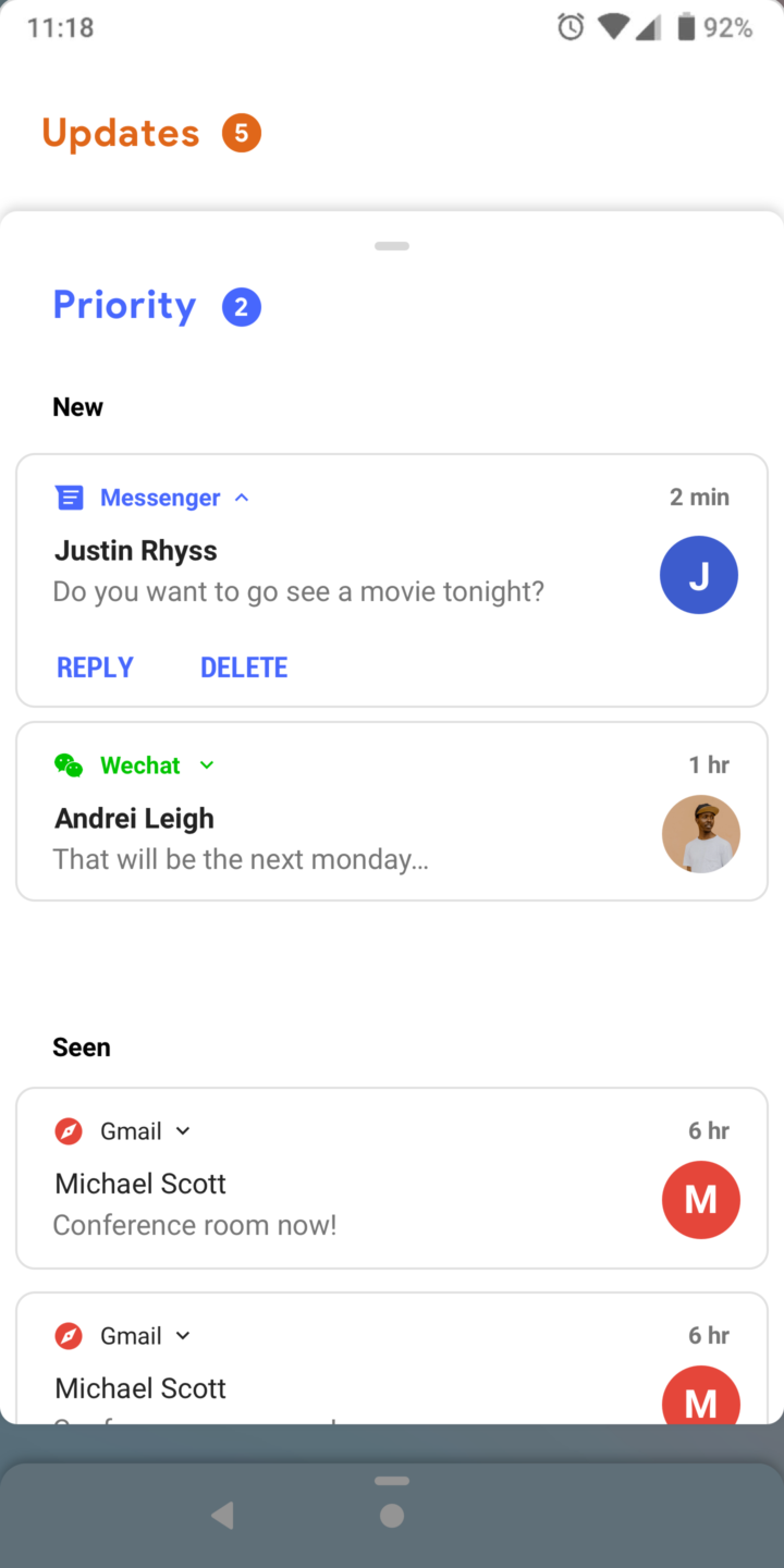
Sectioning new and old notifications: Testing ways to categorize new notifications and old notifications. Allowing natural archieving of past notifications and reducing the need for "clear all"
