Stacked Cards
PROJECT GOAL
Organize relevant smart cards in HiBoard to promote engagement and usage rate
RESPONSIBILITIES
UX, Motion, Prototyping, Presentation
DESCRIPTION
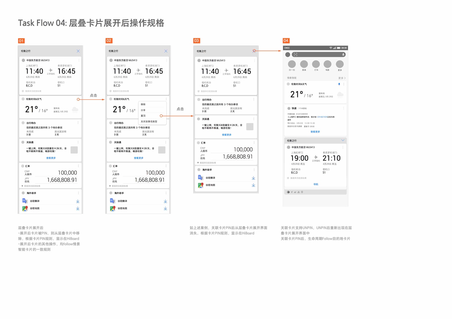
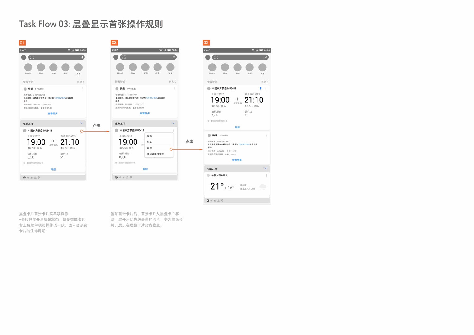
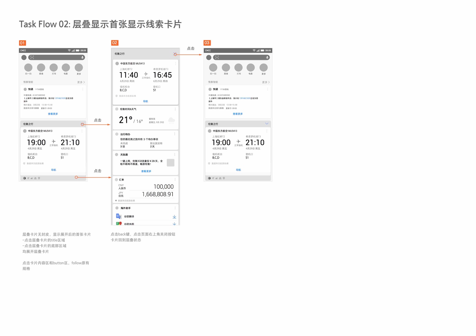
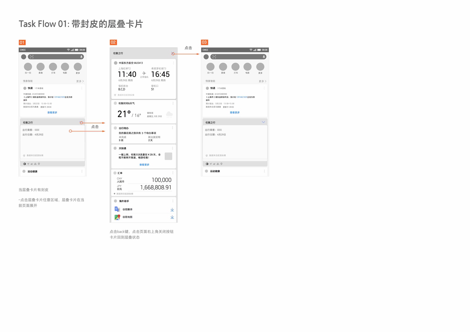
As HiBoard's (Huawei's minus one page) card content grew, it became a dumping group for new services Huawei is offering. We needed to design the minus one page to be organized and digestible. Stacked Cards assists the user in organizing and grouping related cards together in chunks. We explored ways to aggregate cards and stress tested this component with various use cases.
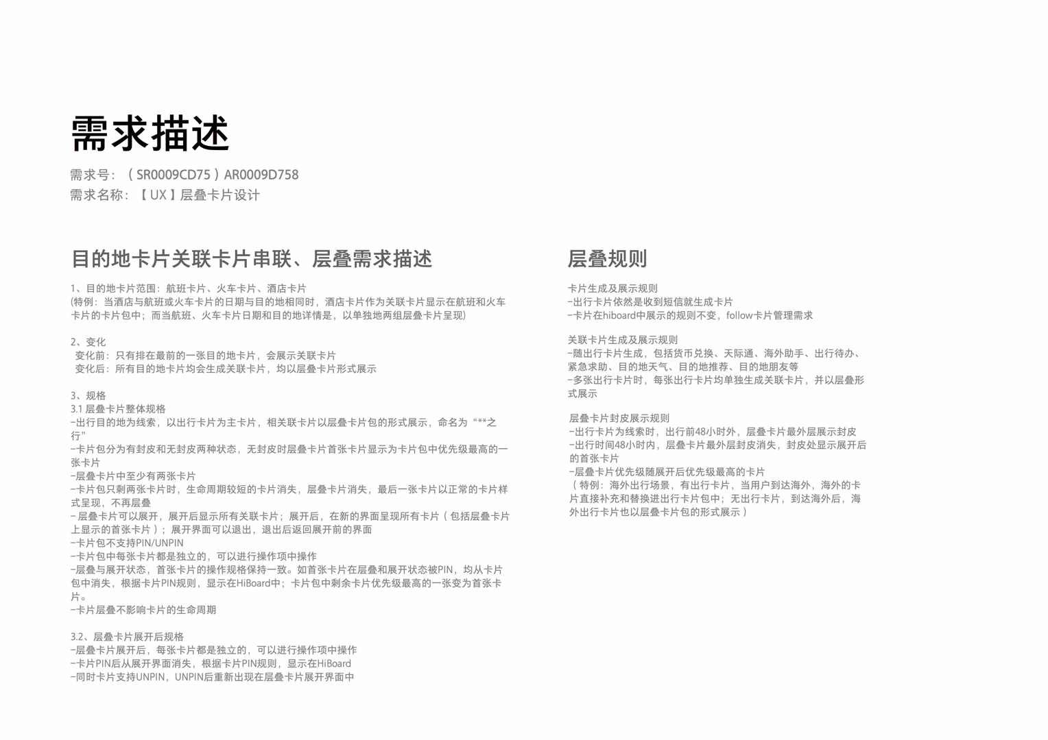
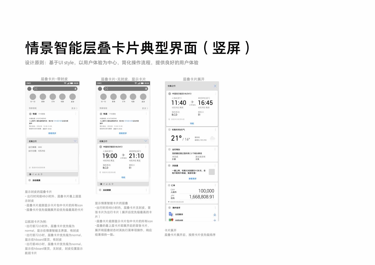
The travel stacked card was shipped in EMUI 8.1 China release.
BEFORE
←
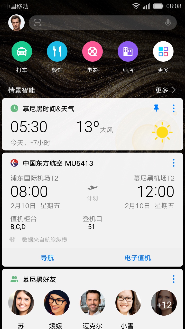
The Problem: is that automatically generated cards are all lumped into the "Smart Scenes" section within HiBoard. We found out that users were often lost and confused about why was a card was generated. Moreover, if a user has multiple events coming up, this section within HiBoard becomes nearly incomprehensible.
We explored a few grouping common denominators such as, by time, by location. But we ended up grouping the cards around events, to contextualize cards and to differentiate the product.
SAMPLE ITERATIONS
↑
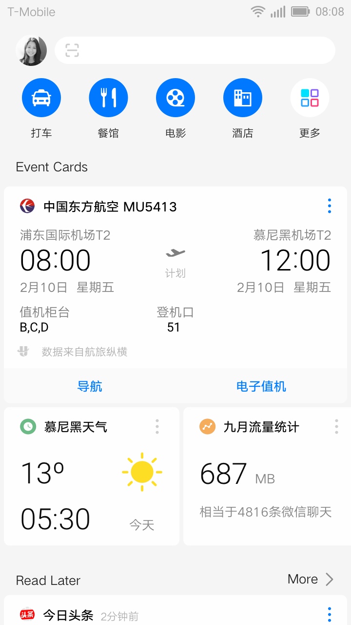
Horizontal Scroll: We quickly ruled this idea out because it is conflicting with the gesture to go exit the minus one screen. Screen real estate utilization is low as well.
↑
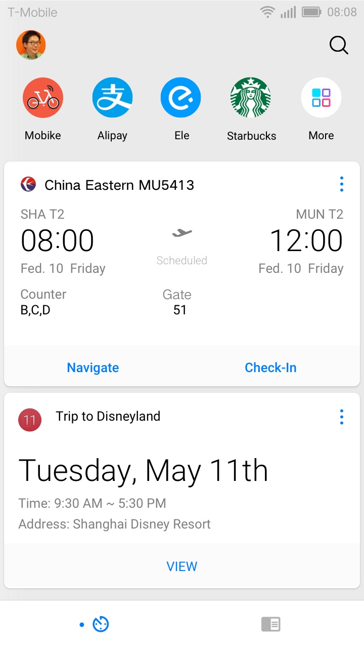
Bottom Nav Tab: Seperating event cards with news cards in two different tabs will run the risk of users having an empty page at times.
↑
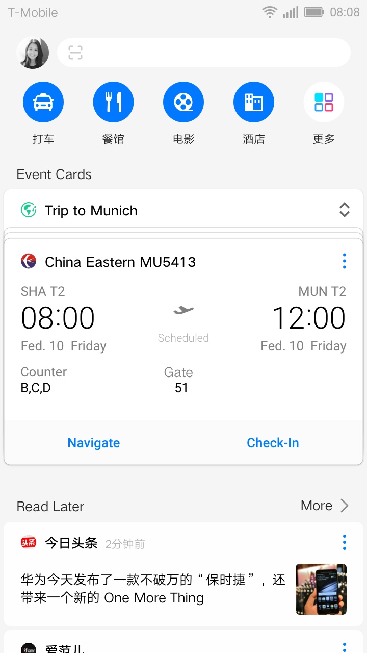
Stacked Cards v1: Stacking related cards together but user testing indicated that the visual affordance was not prominent enough.
↑
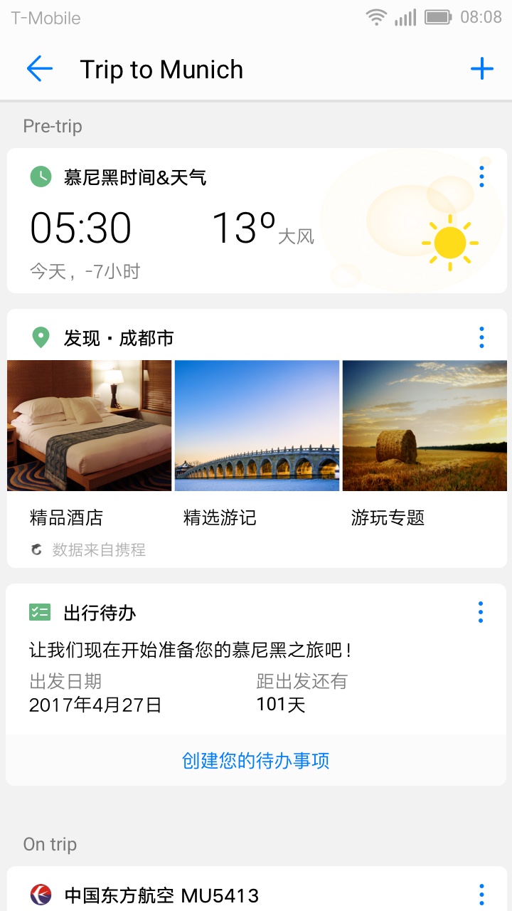
Expanded Stack: User testing showed that the friction jumping in and out of stacks were too high.
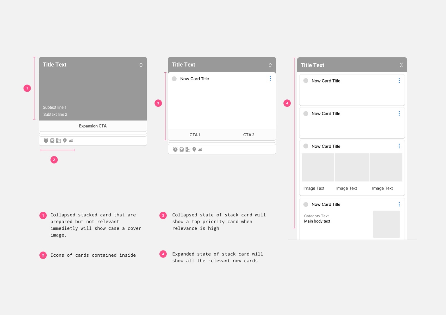
ANATOMY OF STACKED CARDS
DESIGNED FOR FUTURE GROWTH
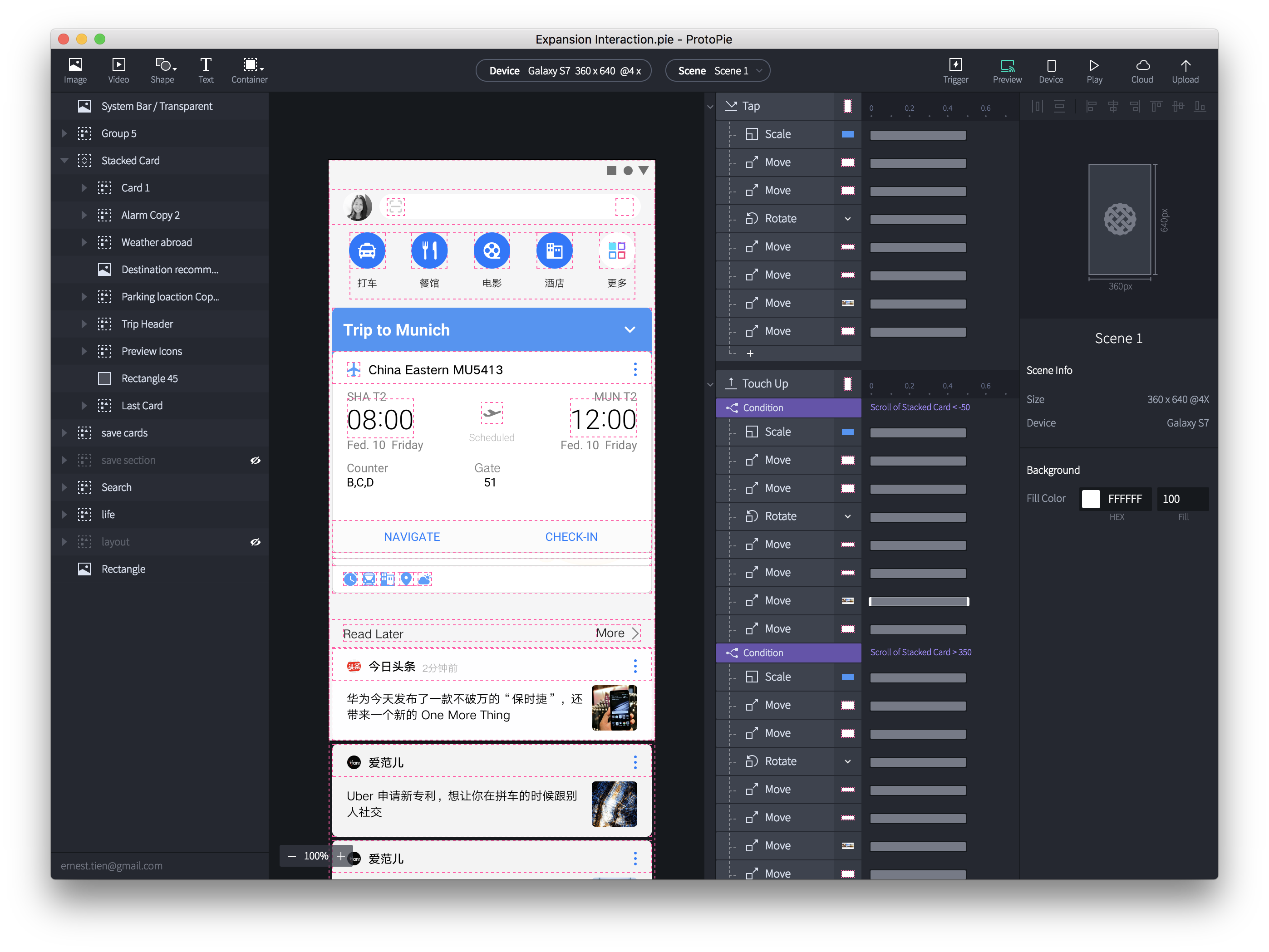
INTERACTION PROTOTYPE
←
Scroll to collapse: Collapsing the stacked cards is as easy as scrolling, making going through the cards seamless.
This interaction feature was added after initial user testing revealing that users were reluctant to expand the stacked cards due to the high efforts required to collapse it back down.
